 Weeks after a complete business reshuffle, internet search giant Google on Tuesday launched a new logo.
“Google has changed a lot over the past 17 years-from the range of our products to the evolution of their look and feel. And today we’re changing things up once again,” Google said in a blog post.
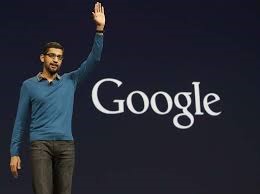
The move is the first noticeable change after the company made a complete reshuffle in its business structure in August. Google was made a wholly-owned subsidiary of a new parent company Alphabet Inc, which have Larry Page as CEO and co-founder Sergey Brin as President, while India-born Sundar Pichai was appointed the CEO of the re-organised Google.
Giving reasons for the move, the company said “Once upon a time, Google was one destination that you reached from one device: a desktop PC. These days, people interact with Google products across many different platforms, apps and devices-sometimes all in a single day.
“You expect Google to help you whenever and wherever you need it, whether it’s on your mobile phone, TV, watch, the dashboard in your car, and yes, even a desktop! Today we’re introducing a new logo and identity family that reflects this reality and shows you when the Google magic is working for you, even on the tiniest screens.”
The small ‘g’ icon has been replaced with with a four-color ‘G’ that matches the new logo. The new logo, it said, shows how Google is working for people.
The company said this is not the first time when it has changed its look adding that “it probably won’t be the last”.


